 HOZU
HOZUHozu UI · the official kit
Componentsyour AIcan change.
Buttons, forms, tables and dialogs that live inside your app as plain files. Ask for a change in your own words, and your AI edits them like the rest of your code.
Revenue
$48,210
+12.4%this month
Open orders
27
−3since Monday
New project
Shown on invoices
Install
Two ways in. Both take a minute.
A new app
Start with the kit already in place.
npx create-hozu@next my-app --ui@next is the Hozu 1.0 candidate. Without --ui, create-hozu asks whether to add the kit.
An app you already have
Add the package, then copy the kit into ui/.
npm install -D @hozu/ui-kitnpx hozu add kit ui --from officialOr one at a time: npx hozu add component ui Button --from official
With Hozu DevTools
Place it on your page. Your AI builds it.
DevTools knows Hozu UI. Pick a component from the kit, put it where you want it on your running page, and say what it is for. Your agent gets a request with the file, the line and the exact call to write.
01
Open Assets
Run npx hozu dev, open DevTools, then Assets. Hozu UI comes first: the components you have, and the ones you can still add.
02
Place it
Select a part of your page. Choose a component and a variant, then Place before, after or inside the part.
03
Say why
Write a note in your words. Or change a component itself: one request edits it everywhere it is used.
04
Hand it over
Copy for AI or Save request. Your agent installs what is missing, places it, then runs hozu check.
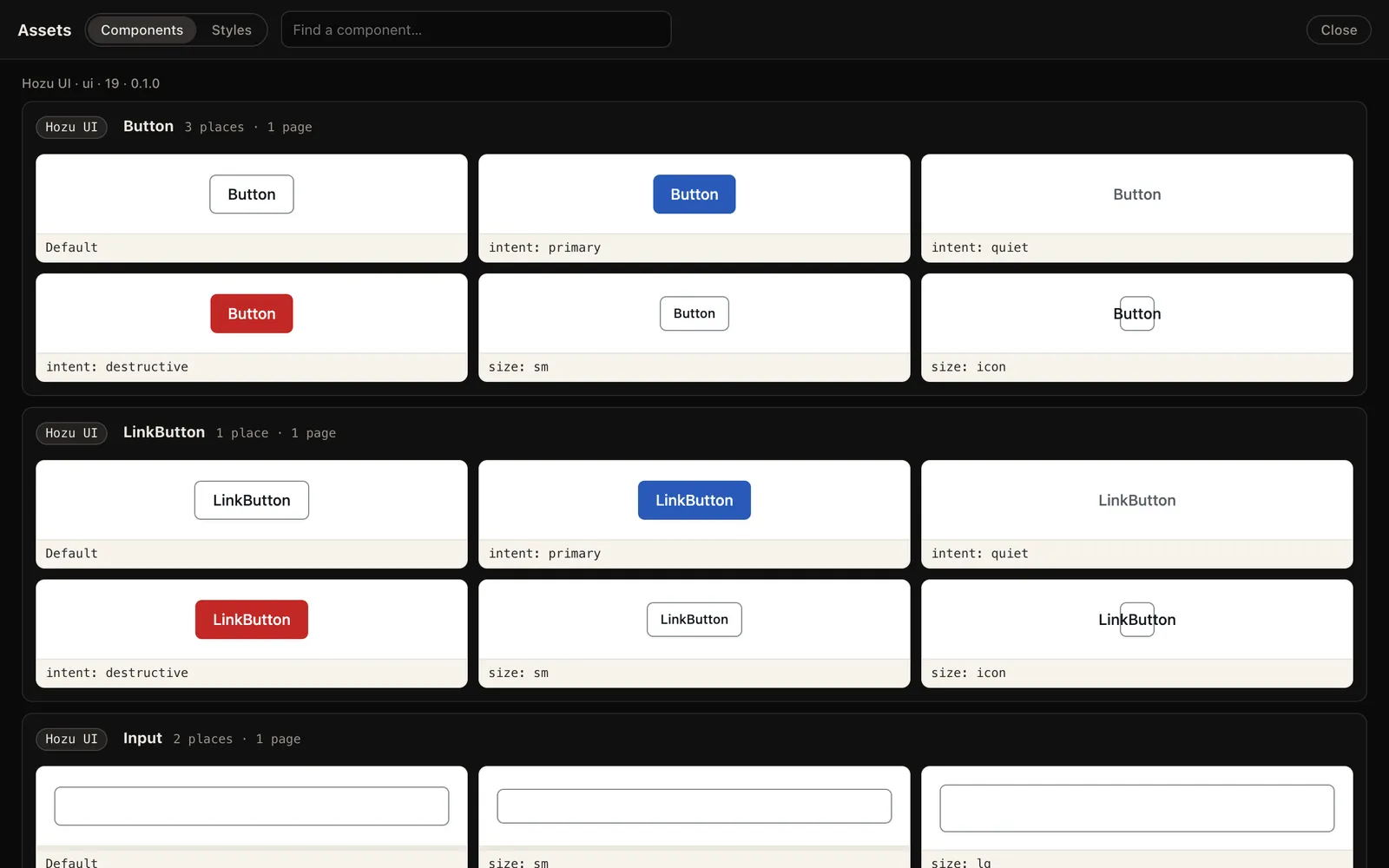
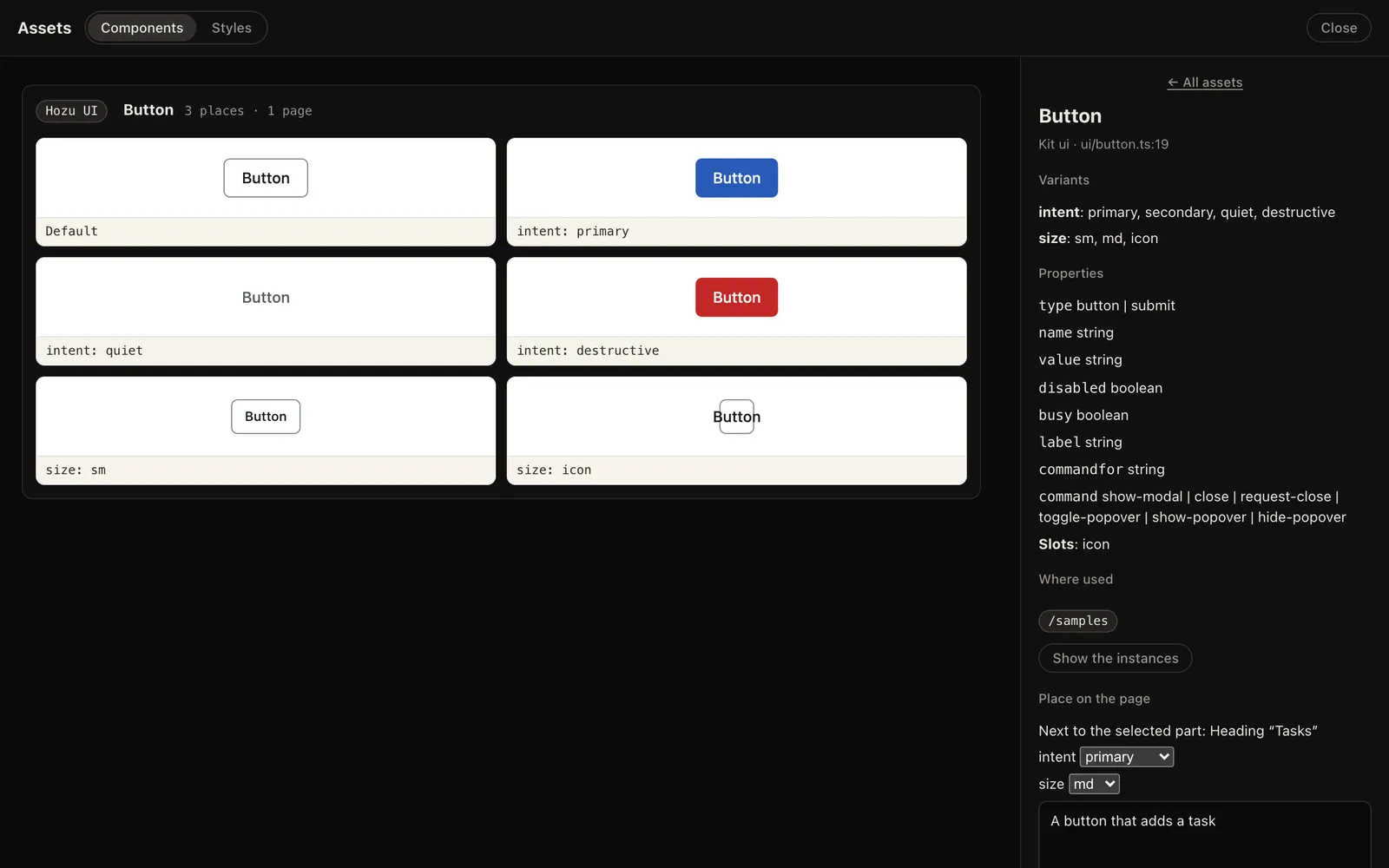
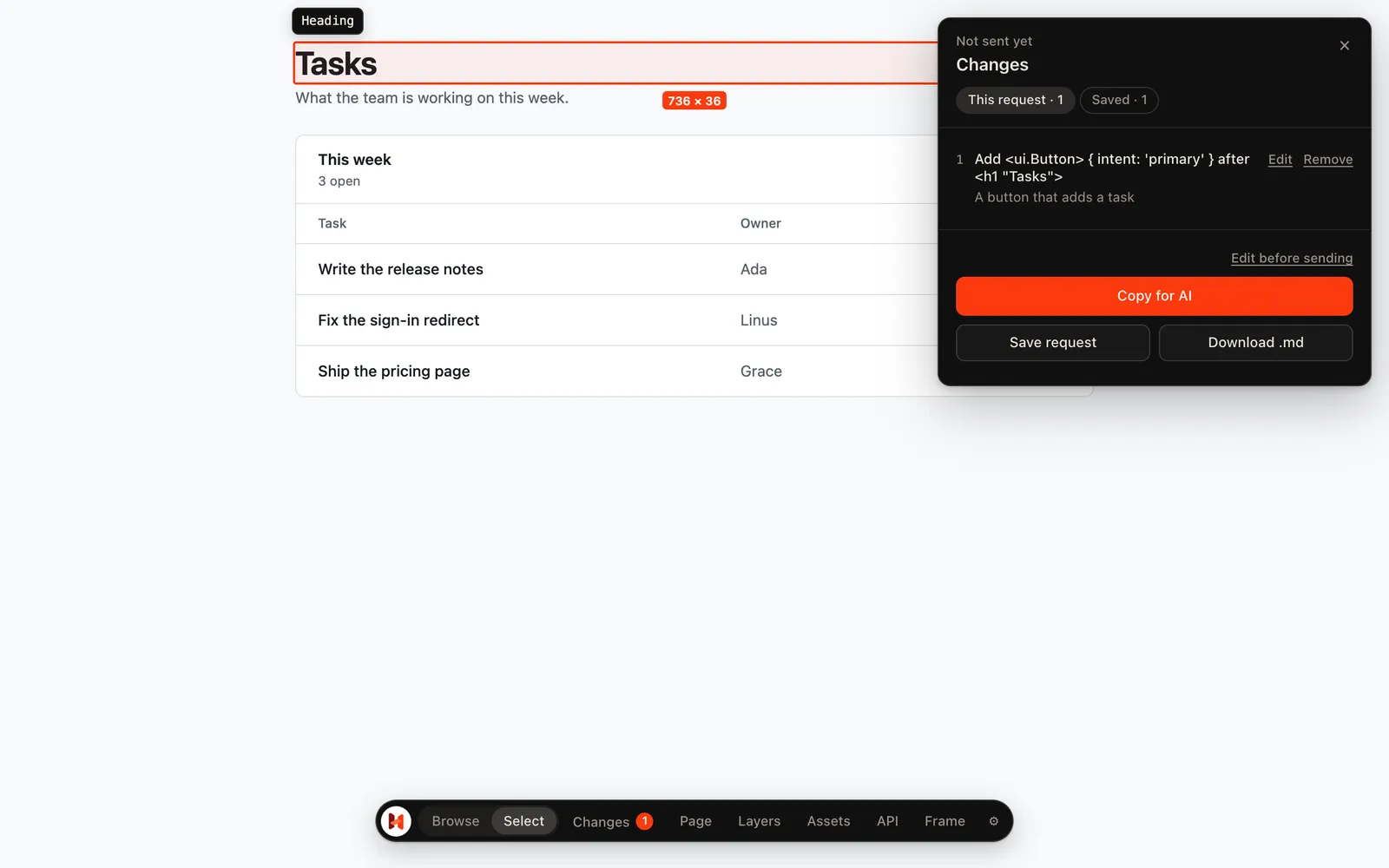
What your agent reads
Plain Markdown: where, what for, and the call to write. If the component is not in your app yet, the request says to install it first.
# Hozu request: A button that adds a task Page `/` · 1280 × 800 ## 1. Add <ui.Button> { intent: 'primary' } after <h1 "Tasks">- Want: A button that adds a task- Where: `features/tasks/views.ts:13:12` (view `tasks.Board`)- Mind: import it from `ui/button.ts`; place `ui.use(Button, { variant: { intent: 'primary' } }, [...])` after it, as a sibling; `hozu docs ui` lists its props and slots.- Locate: `hozu why /features/tasks/views/Board/root/children/0/children/0` Run `hozu check` after the edits.Your files
It is your code. Not a dependency.
ui/ # your copy of the kit├─ kit.ts # lists the components├─ button.ts # Button, LinkButton├─ field.ts · input.ts # forms├─ dialog.ts · menu.ts # overlays├─ … # one file per family├─ theme.css # colour roles, both themes├─ tv.ts # the class merger└─ kit.lock.json # what was installed, for --syncUse one
Import it from ui/ and place it with ui.use. npx hozu docs ui tells your AI which one fits which need.
Change every use
Edit the component’s own file: its styles, props and parts. Every page follows.
Change one use
Add a class at that one place. hozu check counts where you override the component.
Colours are roles
bg-surface, text-ink, bg-accent… The theme replaces the Tailwind palette, so a stray bg-blue-600 is reported.
Updates
Updates keep your edits.
The kit remembers each file as it was installed. A sync replaces the files you did not touch and lists the ones you changed, so nothing of yours is overwritten.
npx hozu add kit ui --syncThemes
Two themes. Then make it yours.
Grain
Calm and rounded, for tools people use all day. The default.
Joinery
Square corners, hard shadows and heavy type, like this site. data-theme="joinery" on any ancestor.
Dark mode
Your call: data-mode="dark", or "system" to follow the device. Every role has both values.